We know you’re always on the lookout on ways to improve your sales execution and planning, making every quarter better than the last. That’s why we’re thrilled to bring you the latest scoop from Lative HQ! Our latest product updates are all about empowering you with actionable insights, making your path to success clearer and more efficient.
Visualize success with graph and tooltip enhancements
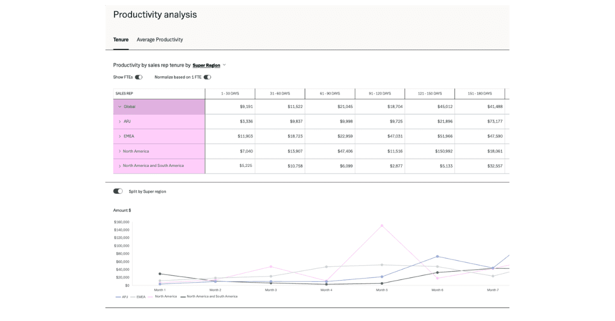
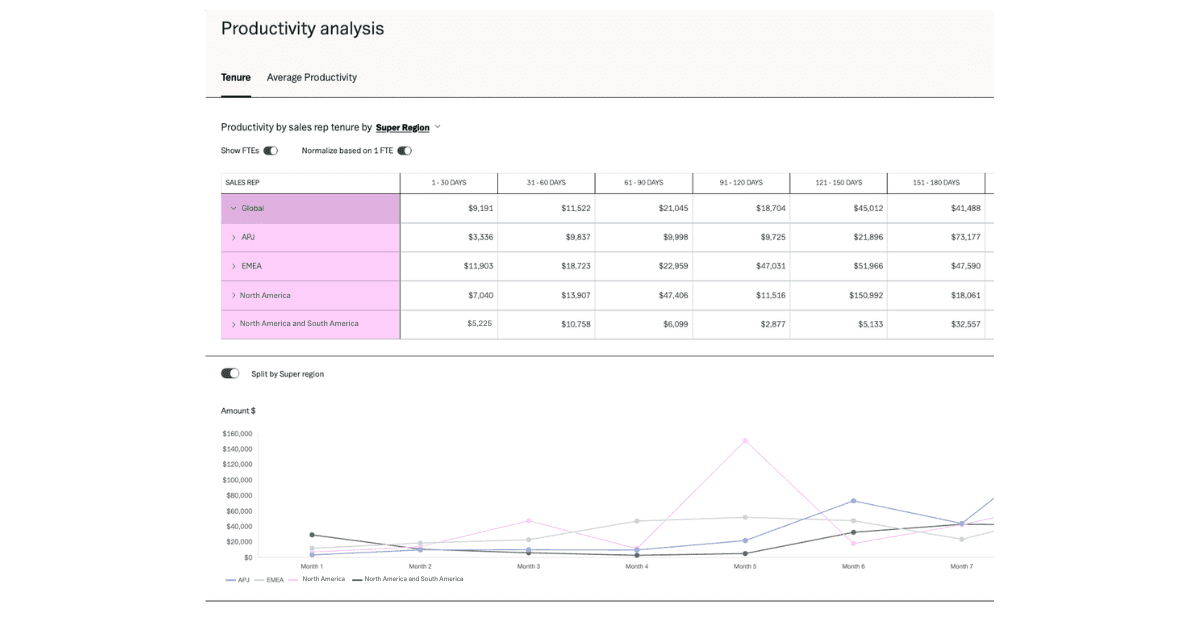
Data visualization just got a major upgrade. Our improved graphs and tooltips are not only easier on the eyes but also pack a punch in making complex data straightforward like your sales ramping schedules. Plus, with dynamic date grouping, spotting trends and patterns is a breeze. Whether it’s understanding shifts in productivity or forecasting future growth, these enhancements put the insights you need right at your fingertips.

Unleash the power of data with CSV exports
First up, we’re introducing the ability to export critical data on tenure and average productivity into CSV files. This means you can now take your data offline, whip up custom reports, or share insights across departments effortlessly. It’s all about keeping everyone on the same page and speeding up those pivotal decisions.
Safeguard your data with enhanced API permissions
Your data’s security is paramount. With our new API permissions, you can rest easy knowing that your sensitive information is locked down tight, while still enjoying seamless integration with the tools your team relies on. It’s about balancing protection with productivity.
Navigate with ease using date picker improvements
Time is money, and our updated date picker knows it. Now showing the current fiscal year by default, it’s never been faster or more intuitive to jump to the exact data period you need. One click is all it takes to travel through time—well, at least through your fiscal periods.
Dive deeper with FTE in roles
We’ve drilled down to a more granular level with FTE in roles, allowing for a nuanced understanding of your actual FTE headcount. This move isn’t just about numbers; it’s about improving the precision of your planning and strategy.
Customize your view with display figures toggle
Last but certainly not least, the new toggle feature on our Performance and Efficiency dashboards lets you control what you see. Focus on the metrics that matter most to you at the moment, and keep your dashboard clean and tailored to your needs.
Ready to Explore These Updates?
We’re excited for you to dive into these updates and discover how they can streamline your operations, secure your data and illuminate your path to success. As always, we’re here to support you every step of the way.
We’re committed to continuously improving your experience and appreciate your feedback.
To learn more, request a demo, contact us or install a free 30-day trial from the Salesforce AppExchange today. We’d love to hear from you!

